Serverless Compare Dashboard
The Altocapa serverless compare dashboard lets you see what you could save by moving from a provisioned to a serverless tier and vice versa. The decision between serverless and provisioned resource tiers is like a decision you may make in taking a taxi or hiring a car. If you are using the car regularly it can make more sense to hire for the period of use. It's similar in the Cloud, with serverless you only pay when a component is being used as opposed to provisioned where you always pay a minimum regardless of use. You would think it would make sense to run everything serverless but as the unit cost is often more than 10 times greater, you really need to understand the usage pattern to make the right decision.

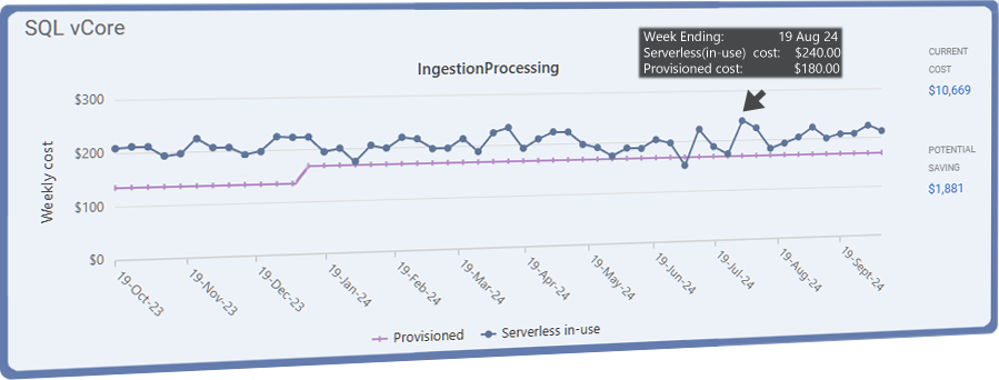
'IngestionProcessing' is an example of a SQL vCore database displayed on the 'Serverless Compare' dashboard. It is currently on the Serverless tier as described by the blue line with round points. The pink bar shows the alternative projected provisioned weekly cost.
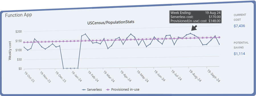
'USCensus/PopualtionStats' is an example of a Function app on the dashboard. It is currently on the Provisioned EP1 tier as described by the pink line with round points. The blue bar shows the alternative projected Serverless weekly cost.
The potential saving on the right of both charts is the saving over the period of the chart.

Try Altocapa FREE trial
Signup now and get full use of the Serverless Compare dashboard for a year!
Also get a summary of the total savings that you can make right now.
Full identification of some infrastructure items leading to actual savings from the trial!
